In this post i will share 15 amazing usefull web services for designers which can helps a lot in our daily work. Personally i use some of them regularly. Hope you will cosider it as i am because i found some of them really helpfull . Most of them are free for use. You dont feel the output of this services untill you use by youself. If you have any other good services in your mind dont hesitate to share it by your valuable comment because i hardly believe that sharing is the great way to fulfill our knowledge.
What: Social snippet repository
Cost: Free
Link: http://snipplr.com
Why: Snipplr is a public source code repository that gives you a place to store and organize all the little pieces of code that you use each day. Best of all, it lets you share your code snippets with other coders and designers. Did we mention it works with TextMate, too? It’s code 2.0.
2.Domainr
What: Pick a original domain name with other TLDs, in the del.icio.us fashion
Cost: Free
Link: http://domai.nr
Why: Desirable .com domain names are scarcer than profitable investment banks. But Domai.nr makes finding pithy URLs easy by querying 280 top-level domains and another 2,014 second-level ones for domain hacks, turning real English words into unique and memorable Web addresses like del.icio.us, internetfamo.us, gee.ky, and iamthewalr.us. Plus, it’s free. — Wired
3. Are My Sites Up?
What: Check whether your websites are up or not and get noticed when they go down.
Cost: Free for up to 5 sites; $25/$50/$75 per year for premium services.
Link: http://aremysitesup.com
Why: When your websites go down, shouldn’t you be the first to know?
Our free plan will check up to five of your sites at least 25 times per day. You get unlimited email and SMS notifications and we will do our best to tell you WHY your site was down by providing the HTML status error code.
Our premium plans offer significantly more features: Faster site checks, an iPhone application, RSS feeds, Twitter integration, Keyword search, premium-level support, and more!
All for just one dollar per site per year (or cheaper!).
4. Templatr
What: Create a simple design with little or no effort.
Cost: Free
Link: http://templatr.cc
Why: It should should be easy to create an individual Design with the templatr. With a little experimentation you will be able to reach the desired result much more quickly than with endless written explanations.
5. SurFTP
What: Web-based FTP client
Cost: Free
Link: http://surftp.com
Why: Once you are logged in, you will be able to navigate the FTP server, upload files, download files, zip files, unzip files, install software, copy, move and delete, copy or move to a second FTP server, rename and chmod.
6. Bespin
What: Open, extensible web-based framework for code editing
Cost: Free
Link: https://bespin.mozilla.com
Why: Bespin is a Mozilla Labs experiment that proposes an open, extensible web-based framework for code editing that aims to increase developer productivity, enable compelling user experiences, and promote the use of open standards. [built using HTML5 technology]
7. Genfavicon
What: Convert images into favicons for your website.
Cost: Free
Link: http://www.genfavicon.com
Why: Genfavicon is a site that features an application that allows you to create an icon out of the image of your choice. Simple select your image, by pasting in the URL address or uploading the image. Then choose which part of the image you wish to make the icon by dragging the mouse and cutting the desired shape. You must then select the size of your icon; 16X16, 32X32, 48X48, 64X64, or 128X128.
Preview what you have chosen and then finalize your icon.
You can then use your icon for your webpage or any other place you would like to put it.
Making your favicon could not be easier, in three quick steps you have made an icon that you can easily paste on your webpage.
8. CSS Sandbox
What: Experiment with CSS styles in real time
Cost: Free
Link: http://aurelio.net/css-sandbox/
Why:
A toy.
A teacher.
A live demo.
A quick reference.
A web application.
A single HTML page.
The CSS Sandbox can be described by all these sentences.
It’s a simple and quick web toy that lets you explore CSS in real time. Just click and see the effect instantly, no Reload needed. It’s fast and funny!
Once you’re satisfied with the style of the Sandbox, roll your mouse over the handy CODE button. A panel will pop, showing all the necessary CSS code to apply that formatting to your own site.
9. Typetester
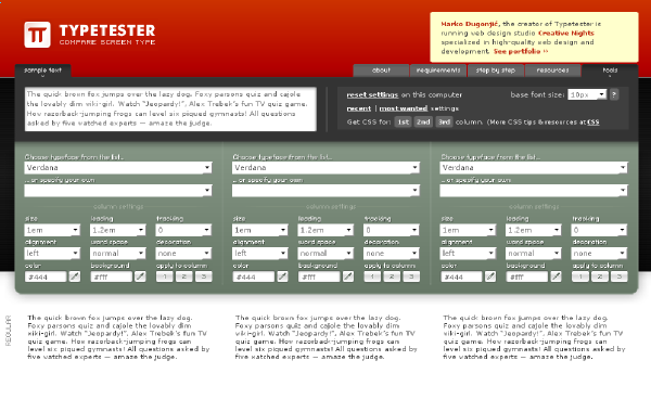 What:
What: Compare screen type
Cost: Free
Link: http://www.typetester.org
Why: The Typetester is an online application for comparison of the fonts for the screen. Its primary role is to make web designer’s life easier. As the new fonts are bundled into operating systems, the list of the common fonts will be updated.
10. Wofoo
What: Form builder
Cost: Free for limited number of entries and one form only; from $9.95/month for more intensive usage
Link: http://wufoo.com
Why: Wufoo strives to be the easiest way to collect information over the Internet.
Our HTML form builder helps you create contact forms, online surveys, and invitations so you can collect the data, registrations and online payments you need without writing a single line of code.
11. BrowserCam
What: Cross Browser Compatibility Testing Tools
Cost: 24 hours free trial; prices vary from $20 to $1000/month
Link: http://www.browsercam.com
Why: See your web design on any browser on any operating system. Check javascripts, DHTML, forms and other dynamic functionality on any platform. Not just yours. Use our bank of testing machines remotely to test your website.
12. Zoho Suite
What: Productivity, collaboration and business apps
Cost: Free for personal use; pricing varies depending on the services needed
Link: http://www.zoho.com
Why: While Google Docs seems to be the first product people think of when online office suites come up, the lesser-known Zoho Suite offers more apps and features. See how Zoho stacks up against Google Docs. — LifeHacker
13. Time59
What: Track time and expenses, handle invoicing and payments.
Cost: Risk-free 30 days trial, $49.95 per year
Link: http://time59.com
Why: Be more organized with less effort. Time59 keeps track of the work you do, gets your invoices out quickly, and manages client payments. Your Time59 account can be accessed from any internet connected computer… at home, at your office, or on the road. Getting started with Time59 is easy. There’s nothing to install, just sign up and you’re ready to go.
14. Mint
What: Web site analytics
Cost: A single site license is $30
Link: http://haveamint.com
Why: Mint is an extensible, self-hosted web site analytics program. Its interface is an exercise in simplicity. Visits, referrers, popular pages and searches can all be taken in at a glance on Mint’s flexible dashboard.
15. CrazyEgg
What: Supplement your analytics with visuals and actionable data
Cost: Plans start at $9/month
Link: https://crazyegg.com
Why: Analytics only give you a static interpretation of your site visitor’s activities. You may be able to tell how many people have visited your site, or viewed a particular page, but you won’t be able to gauge effectiveness of design elements, link placement or popular areas of your site. If you want to know where people are clicking on your site, and which areas could use improvement, you need Crazy Egg. Crazy Egg helps you visualize your visitors.


