


Most of the new designers have this common question. So i decide to write about this topics to gives them idea about width of web sites.Theres are variations in monitor display resolutions. We designers need to decide first How i am gonna represent my site content to users.To do this we need to know first that there are three primary layout types available to design a website. After reading this article any of you can decide which one you can use for your design.
1. Fixed-width Layout (Using pixel-based units for the dimensions of the page)
2. Liquid or Fluid Layout (Using %-based units)
3. Elastic Layout (Using em-based units)
Lets start seeing more details with examples to undetstand what those means.
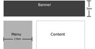
1. Fixed-width Layout

The real bonus of working with a fixed width design is that you can set imagery and design around the consideration that your width will always be the same. This is a real positive if you want a banner image, for example, which needs to be 900px, you will not have to problems when resizing, issues which you would encounter with a fluid design.
The downside of a fixed design however is the dead space that you are left with where your design does not fill the page. A fixed-width design can also force designers to prioritize. As a site grows and content competes for top placement, it must still fit within a specific width.
2. Liquid or Fluid Layout (Using %-based units)

This layout type has gained mass popularity because it is the ultimate way of allowing the total opposite of a fixed layout where the content will simply take whatever space is available to it.
Absolute LayoutsPercentages require careful calculation as you can’t give more than 100% without issues!
The limited guarantees you hold on the viewport being used goes beyond screen resolutions (imagine your site on a 6-inch screen versus a 100-inch screen, even just at 80% width).
Though it goes without saying that a liquid layout is useful in almost every web-based situation because it adjusts its width depending on how big or small the user’s viewport is — so it’s definitely worth looking into.
3. Elastic Layout (Using em-based units)

More accurately, an elastic interface scales with browser text size—commonly a default of 16px—which users can change if they wish. Some people make a permanent change for accessibility reasons, others use the UI controls to increase text size if they need to.
Elastic design uses em values for all elements. Ems are a relative size, written like this: 1em, 0.5em, 1.5em etc. Ems can be specified to three decimal places like so: 1.063em. “Relative” means:
1. They are calculated based on the font size of the parent element. E.g. If a
<div> has a computed font size of 16px then any element inside that layer —a child— inherits the same font size unless it is changed. If the child font size is changed to 0.75em then the computed size would be 0.75 × 16px = 12px.
2. If the user increases (or decreases) text size in their browser, the whole interface stretches (or shrinks.)


